Monday, January 31, 2011

Citroën C3 Sonora

Citroën C3 Sonora E mais uma série especial surge no país. Seguindo o estilo do Peugeot 207 Quiksilver, dessa vez é a Citroën que coloca em voga o combalido C3, na parceria com a loja online de músicas Sonora, e que oferece o mesmo carro de sempre, com motores 1.4 e 1.6 16v, mas com um pacote de benefícios que vai agradar a todo e qualquer internauta amante da música.

Por exemplo, os compradores têm direito a downloads gratuitos de até 250 músicas por mês do acervo completo da Sonora por um ano, além de o carro receber um sistema de som exclusivo, da Pioneer. A versão com o 1.4 (80/82 cv) recebe o aparelho com entrada auxiliar P2 e leitor de MP3, enquanto a 1.6 16v (110/113 cv, sempre com gasolina/álcool) traz Bluetooth, entrada USB e a tecnologia Hi-Fi Like, para melhorar a qualidade do som. As versões seguem o restante dos itens respectivos de GLX 1.4 e Exclusive 1.6 16v, e ambas trazem rodas de liga leve de série.

Read more > Citroën C3 Sonora

Friday, January 28, 2011

Ford Focus Titanium

Ford Focus Titanium Apresentado no último Salão do Automóvel, o Focus Titanium finalmente chega às lojas como hatch e sedã. Substituindo a antiga Ghia, ele vem custando R$ 70.595 para o hatch manual, R$ 75.275 para o hatch automático, e R$ 77.275 para o sedã, que só vem com o segundo tipo de câmbio, preços cerca de R$ 1600 maiores que os das versões Ghia, mas que também representam a adição de alguns equipamentos de série.

Os Focus Titanium trazem farois direcionais, rodas de liga leve exclusivas, porta-luvas refrigerado, retrovisor interno eletrocrômico e sistema de som multimídia My Connection, estes três últimos também incorporados à lista de série do GLX 2.0. De resto é o mesmo Focus de sempre, com uma qualidade de construção impecável e talvez a melhor dirigibilidade do segmento, ainda melhor com as novas caixa de câmbio e embreagem. Seu motor é sempre o 2.0 16v flex, com 143/148 cv.

Read more > Ford Focus Titanium

Thursday, January 27, 2011

Mini Countryman

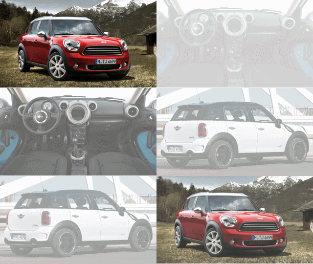
Mini Cooper CountrymanQuem diria que, depois de tanto tempo, o carrinho urbano desenhado pelo sir Alec Issognis iria criar sua própria família? Depois do S, Cabriolet e da perua Clubman, agora é a vez do SUV Countryman chegar ao país nas versões Pepper e S, com preços que começam em 107.700 reais.

Este é o maior dos Mini atuais, medindo 4,10 metros de comprimento frente aos 3,63 do pioneiro. Seu desenho não nega as origens, o modelo parece um Cooper anabolizado, que ganhou linhas em geral mais imponentes e até as portas traseiras, mas sem jamais perder o charme que o caracteriza. Sua cabine segue o estilo, com cores vivas nos revestimentos e um estranho console central que lembra o Mickey Mouse.

Seu pacote de equipamentos é bem extenso; a versão de topo S chega a ter ar-condicionado bizona, bancos de couro, sistema de som Harman-Kardon, freios com ABS e EBD, sistemas como o de frenagem em curvas e controle de estabilidade, e a tração nas quatro rodas ALL4, que trabalha monitorando a demanda para direcionar a tração na melhor proporção – se for necessário o sistema direciona tração total para um eixo só.

O motor é todo novo também, uma unidade BMW 1.6 com 122 cv na versão básica e 184 cv na S, graças à adição do turbo. Esta pode chegar a uma velocidade máxima de 208 km/h, e é comandada por um câmbio automático sequencial de seis marchas. Chamado de Steptronic, ele permite trocas pela alavanca ou por comandos no volante, para as trocas manuais. Resta saber qual será o próximo integrante desta crescente família.

Read more > Mini Countryman

Tuesday, January 25, 2011

Honda Fit DX

Honda Fit DX Desde seu lançamento, o Fit demonstrou que é o típico carro para quem não se interessa por carros; é o tipo de modelo que se preocupou tanto em ser bom em tudo que acaba não tendo nenhum aspecto sobressalente.

Exemplos disso são seu desenho, bonito em geral mas sem chamar a atenção, seu motor, que tem um consumo bom mas sem brilho algum no desempenho, e seus itens de série, pacotes generosos mas que só contêm o comum, além de cobrar um preço alto por isso.

E é justamente pelos altos preços das versões do Fit que a Honda agora lança a versão DX, que ao custar R$ 51.805 com câmbio manual (R$ 55.805 com o CVT), vira a nova versão de entrada da gama. Seu pacote de itens ainda é interessante; o modelo traz de série airbag duplo, vidros, travas e direção elétricos, e o sistema ULT de modular os bancos.

Os sinais de simplificação são poucos, como não trazer sistema de som de série, e as rodas aro 15’’ agora de aço, com calotas. O motor é o 1.4 i-VTEC das versões LX e LXL, de 100/101 cv, (gasolina/álcool).

Read more > Honda Fit DX

Saturday, January 22, 2011

Putting text and pictures side-by-side in blog posts

This article is about lining up text and pictures side-by-side in your posts - and about how to add a "break" so that some text goes beside a picture and some goes underneath it.

The post editor's picture menu:

When you have put a picture into a post  in Blogger, (either using the Insert-picture option on the toolbar, or by adding the HTML for it some other way), the Post Editor gives you options for picture size, and for aligning the picture to the left, right or centre. 

You cab see these options by clicking on the picture.  This opens a "mini-menu" under the picture, like this:


This one mini-menu has options for:
SizeOptions are small, medium, large, extra-large, and original-size
Alignment:Options are left, right and centre (default is center)
Caption:Add caption, and Remove
Properties:Where you can add the hover-title and alternative-text for the picture
Remove:Taking the photo totally out of the post


The alignment options:

When you first add a picture, the alignment is set to "center".

Choosing Left or Right moves puts the picture to the far side of the post and, if the picture isn't as wide as the window it's being displayed in, the text that was after the picture fills up the space on the other side - like this:


Stopping all the text from flowing around the picture:

Many bloggers want to have pictures left or right aligned, and to have some words showing beside the picture.

But they also want to control what text is shown beside the picture, and what text doesn't start until underneath it.   Many people spend a long time putting extra lines into their posts, so that the text and pictures are set up in a way that's "just right" - and then they're disappointed when they publish the post and their hard work is all lost, because the screen is wider and more text fits into the area beside the picture.

There is a very easy way  to control this.  You just need to edit the HTML that is behind the post.  Luckily, this is very easy to do:

1  Put some place-holder or "marker text" where you want the flowing-text to stop.
(eg BREAK HERE  or  XXXXX  - use some words that won't be anywhere else in the post)


I've made it bold and with a yellow background to make it show up in the picture - but I don't recommend that you do this, because it makes it harder to find and replace exactly the correct text later on.

2  Choose the HTML option (top left or top right of the post-editor screen, depending on which version of blogger you are using).

Find the place-holder text
(hint:  use your browser's search function - in Firefox, it's Edit > Find)

Replace the place-holder text with this code:
<div class="separator" style="clear: both;"> </div>
5  Choose the Compose tab  (to get back to the regular post-editor screen).  The text after where the marker text was is now underneath the picture - and it will be there when you publish the post, too, no matter what size of screen your reader has.


Troubleshooting:


Extra blank lines:

At the bottom-left of the post-editor, there is a link for Post-Options.  Clicking this opens an options panel, where you can choose what effect line-breaks (ie pressing the "enter" key) have.   I always put it on "Use <br /> tags", so that I can put extra empty lines into the HTML to make it easier to read.   If it's on "Press Enter for line breaks", then each extra line put into the HTML will also show up in the Compose-mode view, and in the final post.

Editor versions:

The pictures and instructions in this article are based on Blogger's "updated" post editor, not the old one.  The technique will work in the old editor too, but things may look a little different.


Related Articles:


Stopping pictures on your blog from being "clickable"

Getting the HTML code to put a picture into your blog

Putting HTML from elsewhere into your blog

Telling Google about the pictures in your blog

Inserting a picture into a blog post

Applying hover-text to pictures

Tools for applying copyright protection to your blog
Read more > Putting text and pictures side-by-side in blog posts

Friday, January 21, 2011

Audi A1

Audi A1Apresentado ao país no Salão do Automóvel, o A1 finalmente aporta oficialmente por aqui, colocando até a Audi no segmento dos compactos de imagem. Antes se dizia que a inspiração eram os modelos antigos, como os pioneiros Fiat 500 ou Mini Cooper, mas depois o que passou a importar foi mesmo o charme, caso do smart fortwo, e do compacto vermelho destas fotos.

De qualquer ângulo que se olhe, não existe nenhum tipo de saudosismo. Muito pelo contrário, o A1 tem todas as qualidades dos Audi, como o desenho com a frente característica, mas sempre em miniatura. É o conceito seguido pelo seu motor também, um 1.4 de 122 cv com câmbio automatizado de sete marchas. Mas o salgado preço de R$ 89.900 oferece mais.

Seu interior é equipado com tudo. A cabine mistura o DNA Audi com os traços herdados da plataforma do VW Polo europeu, mas ainda assim exala requinte. Sua única versão traz ar-condicionado, freios com ABS e ESP, airbags, sistema de som multimídia e faróis bixenônio. Já entre os opcionais temos itens como teto solar, sistema Start/Stop, GPS e bancos de couro.

Read more > Audi A1

Wednesday, January 19, 2011

Lenovo Showcase LePad

Lenovo's first tablet computer exhibit, LePad, and will soon launch more tablet later this year to seize some part of this product market dominated by Apple iPad.

LePad has a 10.1-inch screen with 2.2 output Android operating system Google and Qualcomm Snapdragon processor 1.2 GHz.

LePad will be sold first in China this quarter at a price between 399-430 U.S. dollars, said Liu Li, a senior manager of Lenovo products.

The company is not sure will sell LePad worldwide but may be offered in the U.S. who has close links with the Android market, he said.

Lenovo also plans to launch a tablet-based Android operating system in the U.S. and possibly others performed in the first half of this year, said Li. He did not elaborate on this further.

Lenovo is China's dominant PC maker, so LePad exposed specifically to this market area, including gaming, news and other local content.

LePad supported Flash, given that most online gaming and video applications in Cgame online generally and video applications in China using flash technology.

Lenovo IdeaPad U1 also showcase a hybrid device that converts LePad into products such as netbooks. LePad serves as a monitor, but also can function as a tablet.

IdeaPad U1 using the Windows operating system and Intel Atom. U1 will dilego at a price of about 1,000 U.S. dollars. The company could not provide further details about the availability of this product.
Read more > Lenovo Showcase LePad

Wednesday, January 12, 2011

Samsung Camera WB700

Samsung camera WB700 features a 24mm ultra wide lens from Schneider KREUZNACH to capture a broad picture perfect, and incredible 24X zoom function, consisting of 18X optical zoom and 1.3X Smart Zoom.


Samsung digital camera WB700 gives sharp images with incredible detail that rely on 16 Megapixel CCD sensor camera.

Samsung Camera WB700 is also equipped with full manual control and the ability to record 720p high definition video in H.264 format.

Samsung digital camera WB700 also features a Smart Filter 2.0 - in a mode of artistic filters such as 'soft focus' as 'half-tone dot' and 'cinema' in addition to traditional features such as 'sketches', 'fish-eye', 'miniature' of all providing entertaining and professional finishing touch with a touch of button.
ec9f0593ea9941a3b9bcc3b5347408f8
Read more > Samsung Camera WB700

Tuesday, January 11, 2011

CES 2011 Best Gadget "Motorola Xoom"

Various electronic gadgets become the latest generation of future trends exhibited complete, the Consumer Electronics Show (CES) 2011 in Las Vegas

Among the brands and products on display, Motorola is able to suck more attention from visitors, especially tablet computer Xoom.


Xoom, a tablet that runs on Android operating system 3.0 Honeycomb, even crowned as the best gadget in the exhibition once a year.

Motorola Xoom has a 10.1-inch wide screen with a resolution of 1280 × 800 pixels. Reinforced Nvidia Tegra processor 2 dual core processors that can generate power to 2GHz.

In addition, there are two embedded cameras. Front of 2-megapixel camera for video calling and rear 5-megapixel camera, which supports 720p high-definition video.

Motorola Xoom plan began to be marketed in March 2011. But not yet known how the selling price of the tablet is touted as the main challenger to Apple iPad.
Read more > CES 2011 Best Gadget "Motorola Xoom"

Monday, January 10, 2011

Ford Fusion Hybrid

Ford Fusion E finalmente o Brasil dá mais um passo rumo ao Primeiro Mundo. Ainda que nosso mercado já tenha recebido o Mercedes-Benz S400 BlueHybrid, não se pode negar que o Fusion tem um preço muito mais acessível, de forma que é com ele que os carros híbridos devem começar a florescer pelo país. Se os quase 134 mil reais pedidos pela Ford parecem muito comparado ao 2.5 comum, o Hybrid traz um excelente pacote de equipamentos, além de todo o sabor de novidade de um legítimo motor híbrido.

Por fora o carro é um Fusion como outro qualquer, salvo por detalhes como os logotipos da versão e as novas rodas. Já o interior é bastante requintado, com uma tela de 4,3 polegadas no console central, além de itens como teto solar elétrico, sistema de som Sony com a tecnologia multimídia Sync (que comanda o Bluetooth, leitores de mídias e um disco rígido do próprio carro), além de sistemas de auxílio a manobras, entre outros.

Mas o grande destaque deste carro são realmente seus dois motores. O elétrico pode produzir até 35 cv e 22,9 kgfm, enquanto o de combustão é um 2.5, totalizando 193 cv e 41,7 kgfm. O motor elétrico traz vários sistemas que tornam seu uso prático, como as baterias que podem ter a recarga interrompida sem problemas, e o sistema de recuperar a energia das frenagens, além do conhecido Start-Stop. Além disso, seu câmbio é do tipo CVT (de relações continuamente variáveis), o que torna as diferentes combinações de uso dos motores algo que não interfere na condução do veículo.

Seu sistema de gerenciamento dos motores é um pouco diferente dos híbridos tradicionais. Aliado ao câmbio CVT, eles podem funcionar os dois em qualquer período, segundo o que seja mais eficiente. Entretanto, até 75 km/h o motor elétrico pode levar o carro sozinho, e é exclusivo das partidas e da marcha a ré, o que simplesmente anula ruídos de motor nestas ocasiões. Os dois trabalham em conjunto nas situações de necessidade de mais força, como em arrancadas fortes e uso na estrada.

Read more > Ford Fusion Hybrid

Sunday, January 9, 2011

Getting a list of people who have asked (via Feedburner) to have your blog-posts emailed to them

This article shows how to get a list of the people who have subscribed to receive the items in a Feedburner feed in their email.  It's written for Blogger users, but applies to anyone who uses Feedburner.

Overview:

Adapted from Rei-artur, original Jak
 CC-BY-SA-3.0-2.5-2.0-1.0
(http://creativecommons.org/licenses/by-sa/3.0)],
via Wikimedia Commons
Previously, I've explained how to set up a feed with Feedburner, and that for your feed to be useful you need to give people a way to subscribe to it.   The options for subscribing to your feed include using RSS feed-reader software (eg Google Reader) or, if you provide the option, subscribing via email.  And Google has now provided the Follow-by-email gadget which makes it even easier for you to add the email subscription option.

Some bloggers prefer people to subscribe by email, because this gives them access to the list of email addresses of their subscribers - making it possible for them to send messages to subscribers separately from posting to the blog.

Getting a list of subscribers-by-email is easy, but you do need to have software that can open a Comma Separated Values (CSV) file to see the list - Microsoft Excel is a tool that lots of people use, but there are many others.


Warning:  
I have not investigated if there are any Feedburner Terms and Conditions about what you may or may not do with the list of subscribers.  I expect that there are some - it's up to you to make sure that anything you do with the extracted list meets these rules.


How to see your list of email subscribers:

Log in to Feedburner, using the Google account that owns the feed.

Click on the name of the feed you are interested in:  this opens the Feed Stats Dashboard in the Analyse tab.

Click on Subscribers from the menu on the left

Scroll down to the Email Subscription Services area

Click on Feedburner Email Subscriptions

Click on Manage your Email Subscriber List

Click on Export - CSV

The download starts:  depending on how your machine is set up you will probably be asked what you want to do with the file (mine opens it in Excel)


Related Articles: 


How to set up a feed with Feedburner.

Subscribering using RSS feed-reader software

The follow-by-email gadget, and easy way to offer email subscriptions

Subscribe to a blog via email.

Providing a give-away for subscribers, using Feedburner

Applying copyright protection to your blog.
Read more > Getting a list of people who have asked (via Feedburner) to have your blog-posts emailed to them

Saturday, January 8, 2011

Dell Latitude E6410 Laptop Review


Dell Latitude E6410 Specifications:

14.1 LED-backlit WXGA+ 1440x900 Display
Intel Core i7 620M processor (2.66GHz, 4MB cache)
NVIDIA NVS 3100M Dedicated Graphics with 512MB VRAM
4GB DDR3 RAM
250GB 7200RPM hard drive (Western Digital Scorpio Black)
Intel Wireless Wi-Fi 6200AGN
Built-in Bluetooth v2.1+EDR
8X DVD burner
One-year limited warranty
9-cell Li-ion battery (85Wh)
Weight: 4.26lbs starting (5.5lbs configured)
Dimensions: 13.2 x 9.4 x 1-1.2-inches

The Latitude E6410 is the latest in a long line of business notebooks from Dell. Sporting a wide range of Intel Core processor options, Intel integrated and NVIDIA NVS 3100M dedicated graphics, and two display options. In this review we see how this Dell business notebook compares to others already on the market.


Build and Design


The Dell Latitude E6410 has a very modern look and feel, with a few changes this generation to give a nod towards past models. The E6400 brought the latest body style, with a black alloy shell. The E6410 this time around keeps the body style, but switches back to the gunmetal gray coloring scheme which was found on the D630 and D620 before it. The finish has a pseudo-brushed appearance (painted, not actual brushed metal like on the HP EliteBook) that seems to resist fingerprints more than the real thing. The lower half of the notebook keeps the black metal design, with a large service panel that lets you access everything in the notebook by removing a single screw.

Inside the E6410 the look is matte black on everything besides the keyboard and model lettering. Compared to what you might find in a consumer model, there are no glossy or reflective surfaces besides the small chrome lettering on the Dell branding logo. This is nice if you use your notebook in brightly lit areas where reflections can be distracting. It also means that smudges and fingerprints won't be a problem from day-to-day use.

Build quality is very good and if feels very durable with the metal panels top and bottom. In the business notebook market not all makers have stuck with metal body panels. After the T60-series ThinkPad, Lenovo switched to a plastic top cover, which has stuck for every generation since then. The HP EliteBook though keeps the metal top cover and retains the image and feel of a higher-grade notebook over a standard plastic consumer model.


The Latitude E6410 chassis felt very well built and resisted any flexing in the usual spots. The palmrest and touchpad showed no signs of sag under heavy prodding. The keyboard directly over the optical drive stayed firm, even though most notebooks do show some signs of weakness in this area. Grabbing the notebook by the palmrest and carrying it around didn't cause any twisting or creaking noises. With the notebook closed the screen cover gave above average protection for the screen and should prevent any keyboard key marks on from imprinting on the LCD after being transported in a backpack loaded with other items. With the notebook open it took a good amount of pressure applied to the back of the cover before it showed any ripples or distortions on the display.

Users looking to upgrade parts of IT staff looking to replacing components will find the Latitude E6410 very easy to service. Dell designed the entire bottom around a single access panel with a single screw holding it in place. After removing the screen (which is retained with a spring so it never gets lost) you simply slide the cover down about a smidge and pop it off. With the cover removed you gain access to the WWAN, Wi-Fi card, memory slots, processor and heatsink, CMOS battery, cooling fan, and the instant-on OS card. Outside of having a cover that removes by the thought of wanting to upgrade alone, the E6410 is probably the easiest notebook we have come across to upgrade.

Ports and Features

The Latitude E6410 is packed with a ton of connections, including three USB 2.0 ports, an eSATA/USB combo port, VGA and DisplayPort-out, audio jacks, LAN, and FireWire-400. Other features include an optical drive, SDHC-card reader, and a SmartCard reader.

modified from notebookreview.com


Read more > Dell Latitude E6410 Laptop Review

Sony VAIO EA Laptop Review


Sony VAIO EA (VPCEA3CFX) specifications:


Intel Core i3 370M (2.4GHz, 3MB L3 cache)
Windows 7 Home Premium 64-bit
14-inch LED-backlit display (1366x768)
Intel GMA HD integrated graphics
4GB DDR3 (1066MHz) system memory
500GB hard drive (5400rpm)
CD/DVD player/burner
Bluetooth (2.1 + EDR)
Ethernet: 10Base-T/100Base-TX/1000Base-T
Wi-Fi: Intel Centrino Advanced-N 6200 (802.11/b/g/n)
Intel Wi-Di (wireless display transmitter)
Standard Capacity Lithium-ion Battery (5000mAh)
Dimensions: 13.60(W) x 1.07(H) x 9.39(D) inches
Weight: 5.2 pounds
Color: Coconut White

Build and Design

The Sony VAIO AE is the latest 14-inch general purpose laptop from Sony. The E-series notebooks are the most affordable full-featured notebooks in the VAIO product line and you can probably argue that the "E" stands for "Economy class." The laptop body is made of a combination of matte black plastics and polished plastics in your choice of Lava Black, Hibiscus Pink, Coconut White, Iridescent Blue, or Passion Purple colors. Our review sample is "Coconut White" but pearl white might be a more accurate description of the color in real life. All of the plastics feel firm with no obvious flex or creaking sounds when you apply pressure to the chassis. Despite being designed as a budget laptop, the VAIO EA feels reasonably well built. The screen hinges offer enough resistance to hold the display in place yet aren't so tensioned that opening the laptop is difficult.

The screen lid, palm rests and touchpad plastics are made with overlapping layers of clear acrylic with different patterns on different layers. The end result is a multi-layer design that looks a bit like the scrolling pixel code in The Matrix movies. Don't let that description prevent you from considering this laptop; the effect is pretty subtle since the layered patterns are done using the same color as the rest of the laptop. Most people won't even notice the design on the lid or palm rests unless they are within a few feet of your laptop.

Users looking to upgrade or tweak the VAIO EA will find plenty to keep them happy once they look at the bottom of the notebook. Sony engineers were kind enough to include two access panels on the bottom of the chassis that allow you to replace the RAM or the hard drive with whatever you want. Since our review unit came with 4GB of system memory and a 500GB hard drive it's unlikely that most consumers will upgrade either, but if you decide to purchase a high-performance solid state drive (SSD) then it's good to know that you can easily put it inside the VAIO EA.

Ports and Features

Port selection on the VAIO EA is excellent. The system has three USB 2.0 ports, one additional eSATA/USB combo port, a headphone and headset jack, VGA output,  HDMI output, Ethernet, and both SDHC card and Memory Stick slots. USB 3.0 would have been handy given the increase in compatible accessories these days, but since the VAIO EA also includes an ExpressCard slot you can add a USB 3.0 adapter.

modified from notebookreview.com


Read more > Sony VAIO EA Laptop Review

Friday, January 7, 2011

Fiat Uno Sporting

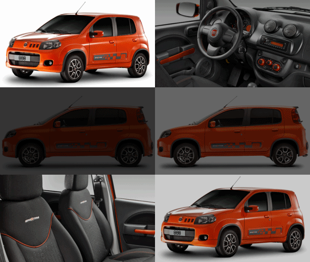
Fiat Uno SportingA Fiat do Brasil definitivamente resgatou sua veia esportiva. Para quem já teve em sua gama versões Turbo de Uno, Tempra e Marea, alguns anos depois os italianos feitos em Betim tiveram os ânimos refreados, como com o “morno” Brava HGT. Entretanto, se no Brasil o uso de motores exclusivos se torna caro em excesso, a série Sporting da Fiat vem enchendo os olhos. Primeiro pelos acessórios de muito bom gosto, e segundo pelo fato de que ela não pára de crescer.

Sim, depois de Stilo, Punto, Idea, Siena e Strada, agora é o caçula Uno quem adere à nova estirpe. Nada mal para quem já tinha a versão de baixo custo Vivace, requintada Attractive, e aventureira Way. O exterior do carro encanta à primeira vista. Seja pelas novas cores como o laranja exclusivo, ou pela frente com a grade de três quadrados com aros vermelhos, em qualquer lado o carro cativa. É o caso da traseira com o spoiler sobre o vidro e lanternas fumê, e das laterais com o adesivo próprio, e as belas rodas aro 15”, que ficam bonitas mesmo com os paralamas largos.

Fiat Uno SportingO interior não traz tantas novidades, mas as que tem são interessantes. A cabine ganhou detalhes laranja pelos botões do ar-condicionado e no puxador das portas, que por não serem grandes dão um ar bem jovial. Os bancos também mereceram atenção, ganharam revestimento exclusivo com o nome Sporting. A lista de itens de série não é das mais generosas, mas com os opcionais o carro fica muito mais atraente, e sem chegar a um preço abusivo. Outra vantagem é que todas as versões ganharam a opção do pacote de adesivos Run, com a mesma quantidade de itens dos anteriores.

Mas como era de se esperar, sob o capô não há novidades. O 1.4 Fire Evo também equipa este modelo, com todos os seus 85/88 cv e 12,4/12,5 kgfm de torque (gasolina/álcool) e oferece 0 a 100 em até 11,2 segundos, com máxima de 172 km/h. Seu preço inicial é de R$ 33.970.

Read more > Fiat Uno Sporting

Wednesday, January 5, 2011

Adding a "share this to LinkedIn" option to your blog

This article is about putting a "professional share" button onto your blog, to let viewers share a post on LinkedIn.  Although it's written for Google Blogger users, most of the information applies to any website that wants to encourage visitors to promote the site on LinkedIn.

Blogger and LinkedIn - a strange combination?

LinkedIn is a professional social networking site:  it's like Facebook for people's working lives, and it is a place where they can interact with current and former colleagues, peers, counterparts from other companies, and other professional (rather rather than personal) connections.

If your blog isn't related to your job, then LinkedIn may not seem relevant.

But chances are that your hobby is of professional interest for some of your readers.   Giving them the opportunity to share your content to LinkedIn may be valuable for you (promoting your blog) and them (growing their credibility by sharing good information with their associates).


"The art of the professional share" - LinkedIn's share buttons

LinkedIn now offers official sharing buttons.

Even if you don't have a LinkedIn account yourself, you can go to their Publishers page, and get the code for a sharing button.   Currently they have options for:
  • Vertical button with count
  • Horizontal button with count
  • Button without a count (looks the same horizontal or vertical)

There is also an optional field where you can enter the URL to be shared:  this could be useful if you want to give readers to opportunity to promote a different page or website from your blog.

The code that LinkedIn provide is simple, and you can install it just the same way that you install any social-networking sharing button onto your blog.


What your viewers see:

When one of your viewers clicks on the "Share to linked in" button, they are shown a new window (even if they already have LinkedIn open in another tab).

If they're not currently logged in, they are asked to log in or to join if they don't already have an account.   (For a while, LinkedIn was exclusive:  you could only join if you were invited by a member.  those days are long-gone.)

Once they are logged in, the window looks like this:


The LinkedIn user can choose:

To edit the details of the shared item:
They can change the title (which defaults to the title from the window where the link was clicked), and also add some supporting text.

Which picture to show with the shared item:
Like Facebook, LinkedIn pulls the various options from your blog-screen, both the post and also the sidebars.   The << and >> buttons let the user move between the possible pictures.  The option for "no picture", is under Edit.  Some people may miss this, and think that the picture is compulsory, so you should make sure that there's always at least one good picture available on your posts.

Whether to post the shared item as:
  • An update.  This is the LinkedIn version of sharing to the wall.  It can include a comment, and whether to send the update on to Twitter (if the person has a linked account) and who the update should be visible to (anyone or connections only).
  • A message to a LinkedIn Group that they are a member of:  in this case, they need to enter a subject and a message, to go with the link.
  • Individual messages to existing contacts, or even to people (email addresses) that they aren't connected to.   This option includes a check-box for whether or not recipients can see each other's email addresses.
Your reader can choose one or more of these options.   When they have entered the details, pressing Share sends updates and message as specified.   Then the user must choose between to continuing to Share the item (ie setting different options), going to view it themselves, or closing the window.


Related Articles: 


Installing any social-networking sharing button onto your blog.

Linking your blog to the social networks

Using Feedflare to add social tools to your RSS feed

Adding a Tweet button to your blog

Tools for applying copyright protection to your blog
Read more > Adding a "share this to LinkedIn" option to your blog

Tuesday, January 4, 2011

Fiat Punto Essence 1.6 16v Dualogic

Fiat Punto 1.6 Dualogic Recentemente atualizado, o Punto sempre foi um modelo impressionante, de desenho irretocável e requinte condizente com seu segmento, mas o problema estava sob o capô: o 1.4 Fire do Palio nunca combinou com seu peso maior, e o 1.8 da Chevrolet não estava à sua altura. Agora que a Fiat já criou as versões Essence e Sporting com dois motores totalmente novos, ela amplia a gama do compacto premium para explorar melhor todo o seu potencial, com uma versão que começa em R$ 47.350.

De início apenas as versões de motor 1.8 16v ofereciam o câmbio Dualogic, então agora a novidade é que o 1.6 16v também pode ser automatizado. De resto é o mesmo Punto Essence de antes, com itens de série como computador de bordo, piloto automático e retrovisores elétricos. Já seus opcionais são muitos, como o conhecido sistema de som multimídia, rodas de liga leve aro 16’’ e spoiler traseiro. O motor produz 113/117 cv (gasolina/álcool), suficientes para levar o carro de 0 a 100 km/h em até 10,5 segundos, e a 182 km/h de máxima.

Read more > Fiat Punto Essence 1.6 16v Dualogic

Putting "Share this on WHATEVER" button(s) into your blog

This article shows you how to put "share this on XX" (ie any of  Facebook, Twitter, LinkedIn, or any  other social networking sites ) buttons etc into your Blogger blog, including having individual buttons inside post.
 
Overview:

Thumbs up symbolPreviously, I've described the different ways of linking your blog and the social networks.

And I've described options for sharing-to-Facebook so that readers can share your posts on their wall (etc).

This article is about the options for putting share-buttons from any of the social networks onto your blog.    (fyi, the Facebook article describes why I think you should only every use official share gadgets provided by the site that you want to share with - though I have softened this attitude a little since ShareThis and AddThis started re-directing people to the social-networking site concerned before asking for a password).

So far, I've found five options:
  • Option 1:  Sharing button as a gadget
  • Option 2:  Sharing button in the post footer
  • Option 3:  Sharing buttons in a floating button-bar 
  • Option 4:  Sharing button in the post header
  • Option 5:  Sharing button (looking like) it's inside the top of the post.

Option 1:   Sharing button as a Gadget

To add a share-button as a gadget (ie in your sidebar, header or footer):

1  Go to the social networking site, choose the options you want and copy the code they provide

2  Follow the instructions in Option 1 of Putting HTML code from a third party into your blog.


Issues and Disadvantages:
If you put the Share button into a gadget, what will (usually) be shared is your blog overall, not the specific post that is being read.

The 3rd party code article also has instructions for putting code inside a post, and for putting code into your template.   You can put share-button code into individual posts if you want, although this would make it very difficult to change the button options later on.


Option 2:  In the Post-footer

This (or Option 4) is currently my preferred option, because it lets your viewers share the post they are reading at the moment, no matter whether the screen they are reading is showing one post or lots.

However you do need to accept the disadvantages of editing your template.

To set it up:

1  Go to the social networking site, choose the options you want and copy the code they provide

2  In Blogger
  1. Choose
    In post-Sept-2011-Blogger (ie the old fnterface):     Layout > Blog Posts (edit)
    In pre-Sept-2011-Blogger (ie the old fnterface):   Design > Page Elements > Blog Posts (edit).
  2. Look at the footer (the area below posts which you can drag items to). 
    Pick one of the footer lines (ie 1, 2, or 3) to put the share-button (s) on.
    Make sure there is nothing else on that line.   Remember which line number it is.  Cancel from editing Blog Posts.
  3. Choose
    In post-Sept-2011-Blogger (ie the old fnterface):   Template > Edit HTML > Proceed
    In pre-Sept-2011-Blogger (ie the old fnterface):   Design > Edit HTML. 
  4. Download a full copy of your template, and put it somewhere safe.
  5. Tick the  Expand Widget Templates check box.
  6. Find this code (where N is the number you remembered in step 2):
    <div class='post-footer-line post-footer-line-N'/>
  7. Paste the code from the social networking site immediately underneath that line.
  8. Click Preview, to check that the code is correct and your blog looks the way you expect.  Correct any problems.
  9. When you are happy, choose Save Template.
  10. It at all possible, test the sharing button, so you are certain you are happy with how it works.    It's best to make sure you are signed out of the social networking site before you do this.

    (This may mean that you put some entries about the blog on your own LinkedIn or Facebook status, since those systems don't let you have test accounts.  If your blog is a hobby not related to your profession, then it's a judgement call about whether to do this with LinkedIn, or whether you just take the risk that the button isn't working properly.)

Option 3:  In a floating gadget bar

This is a popular option, because it lets viewers share the post they are reading, not just the whole blog, although I've had issues with the bar appearing at strange places on some sites.

Blogger Sentral has written an excellent description of how to implement it:  See his instructions for installing buttons in a floating gadget-bar.


Option 4:  In the Post-header

This is very similar to Option 2 (in the post-footer), except that step 6 becomes:
Find this code :

<div class='post-header-line-1'/>

And paste the sharing button code immediately after it.


Option 5:  Sharing button "inside" the top of the post.


Note this isn't "inside" the post at all - it's actually immediately to the right (or left) of it, as shown in the picture.   But to your readers, it looks like it's inside.   Follow these steps:

  1. Choose
    In post-Sept-2011-Blogger (ie the old fnterface):   Template > Edit HTML > Proceed
    In pre-Sept-2011-Blogger (ie the old fnterface):    Design > Edit HTML. 
  2. Download a full copy of your template, and put it somewhere safe.
  3. Tick the  Expand Widget Templates check box.
  4. Find this code 
          <data:post.body/>
  5. Add this code immediately before it:
    <!-- START OF SOCIAL SHARE BUTTONS ...  -->

    <div style='float: right;'>

    <b:if cond='data:blog.pageType != &quot;static_page&quot;'>

    <div style='padding:3px 0px 8px 2em;'>
    CODE FROM SOCIAL NETWORK GOES HERE ...
    </div>

    <div style='padding:3px 0px 8px 2em;'>
    CODE FROM SOCIAL NETWORK GOES HERE ...
    </div>

     <div style='padding:3px 0px 3px 2em;'>
    CODE FROM SOCIAL NETWORK GOES HERE ...
    </div>

    </b:if>
    </div>

    <!-- END OF SOCIAL SHARE BUTTONS ...  -->

    You can customise this:

    If you want the buttons at the left of your post instead of the right, change     <div style='float: right;'>    to     <div style='float: left;'>

    Also experiment with the amount of space around each button:   notice that each "button holder" has  this in its "div" statement:      style='padding: Tpx Rpx Bpx Lem;

    This controls the amount of space at the Top, Right, Bottom and Left of the button.  

    In the example above, I've put zero space on the right (since the templates other margins do this), 2 em's of space (roughly two characters of the font used) between the post and the buttons, 8 pixels between buttons, and 3 pixels at the top of the top one, and bottom of the bottom one.

    Also, some things to note about the code:

    There is a <div> </div> pair around the outside - this is important, because it controls the button "section" and puts at the right (or left) of your post.

    The buttons are only put on posts, not on Pages.   If you want to change this, remove the
    <b:if cond='data:blog.pageType != &quot;static_page&quot;'>   and    </b:if>     pair. 
  6. Paste the code from the social networking site in the places shown - you can add more <div> ... </div> blocks for it if you want more share-buttons, I've just shown two to get you started.
  7. As with any template editing click Preview to check that the code is correct and your blog looks the way you expect.  Correct any problems.
  8. When you are happy, choose Save Template.
  9. It at all possible, test the sharing buttons, so you are certain you are happy with how they work. 


Related Articles: 


Putting HTML code from a third party into your blog

Advantages and disadvantages of editing your template

Ways of linking your blog and the social networks

Options for sharing-to-Facebook.

Read more > Putting "Share this on WHATEVER" button(s) into your blog

Saturday, January 1, 2011

HP Slate 500 Review


 Specifications:

Slate tablet design starting at 1.50 lb/0.68 kg
8.9-inch diagonal LED-backlit WSVGA wide-viewing angle display (1024 x 600 or 1024 x 768 for some applications)
Capacitive multi-touch screen with pen digitizer
Integrated 802.11 b/g/n wireless LAN
Bluetooth 3.0 + HS
Intel System Controller Hub (SCH) US15W chipset and Intel Atom™ processor
64 GB SSD
Secure Digital (SD) slot
Two integrated webcams (VGA inward facing; 3 MP outward facing)
HP Slate Dock, HP Slate Digital Pen, and HP Slate Folio are optional accessories that may be included on select configurations

As a tablet PC user since the launch of Windows XP Tablet PC Edition in November 2002, I've longed for a lightweight, portable and thin slate device that essentially functions as a digital notepad computer, and this is what I believe HP has delivered in the 500. There's nothing new here, the Slate is just a vanilla Windows 7 Professional device with practically no 3rd party applications installed except Evernote and the camera software, but I think that's actually a good thing as it keeps the unit from being bogged down given its adequate but less-than-powerful Atom platform.


Build & Design

The HP Slate 500 packs a lot of hardware into its svelte 5.91 x 9.21 x 0.58 inch body, and it only weighs 1.5 pounds to boot. The unit is impressive with an Atom Z540 1.86 GHz CPU, 64 GB SSD, 2 GB of DDR2 RAM, front-facing VGA camera, rear-facing 3 megapixel camera and an 8.9-inch 1024 × 600 screen with an N-trig Duo Sense capacitive touch and digital pen digitizer. This combines to give the HP Slate 500 topline specs at a topline price compared to most consumer slates. The 500 is sealed with no user replaceable battery or other parts.

The device is physically attractive and the rubberized back with a distinctive textured repeated pyramidal design with the HP logo in the center allows for good gripping either lying on a surface or in one's hand, and the flat back allows the Slate to function well for inking on a desk.

The device is fanless and completely silent but still manages to keep cool most of the time. The back does get quite warm when the device is charging or being taxed, such as when playing HD video. It's not scalding, but it might make your hands sweat.

Ports, connections, buttons & accessories

The Slate has one USB port, a full SD slot, a combination headphone/microphone jack and a combined power/dock connector. There are five hardware buttons along three sides of the machine. On the right in the primary landscape orientation is the combination power and screen rotation lock switch that disables the accelerometer. At the top right is the home button that minimizes all open windows and when held down for several seconds turns off the display backlight. To the left is the Control-Alt-Delete button for domain security purposes. On the top left is a volume rocker and finally on the left side is a toggle button for the Windows Tablet Input Panel.

The dock is lightweight with a folding leg and provides two additional USB ports, a headphone/microphone jack, a power connector that's identical to the one on the HP Slate 500, and finally an HDMI output. The Slate pops in and out of the dock nicely.

The metal digital pen uses an AAAA battery and is very comfortable to hold but the battery cap at the top is a bit flimsy, I've already broken the plastic ring around the top but fortunately it hasn't interfered with the pen's function as far as I've noticed. As with most digital pens on tablet PCs, it has a right click button.

The leather portfolio is form fitted for the Slate and has cutouts for the cameras and a strap holder for the pen. It reeks of professionalism and is a wonderful touch to the package as the Slate 500 is a device many will want to take to professional settings such as meetings.

The total weight of the Slate, dock, AC adapter, portfolio and pen is 3 lbs. according to my postage scale, which is accurate to within two ounces.

Screen

The 8.9-inch screen is bright however, viewing angles are not very good in primary landscape mode. I've found that rotating the screen 180 degrees so that the HP logo is at the top provides better image quality especially for video when viewing the screen outside of 45 degrees.  As is common with slates, the screen is smooth and glossy and does produce glare, but I've not found it distracting in normal indoor lighting conditions though bright and direct sunlight will washout the screen. There is a good amount of backlight bleed around the edges of the screen. It's not typically a problem but it is noticeable with darker colors and blacks, especially during video playback in darker lighting conditions.

Performance

As the HP Slate 500 is essentially an Atom based netbook running Windows 7; it's simply not a speed demon. It has a Windows Experience Index of 2.7, with the 2.7 being the CPU rating, which is a bit higher than first-generation netbooks, and the 64 GB SSD does help to keep things humming along nicely for a netbook.
You'll find that common desktop applications like Office 2010 run wonderfully. Web browsing in IE 9 Beta overall is a solid experience with all of the Flash and other browser plug-ins you've become accustomed to in Windows.
That's not to say that web browsing on the Slate 500 is a super smooth experience in all cases. While most web sites run well, there are some that just don't. Some vertically-oriented sites will often stutter when scrolling, which can be frustrating particularly while using the touchscreen. On the flipside, pure Flash sites like Geforce.com run very well. Major sites like YouTube, Facebook, etc. all run fine. You'll have a blast updating your Facebook page with a pen!

Touch Interface

The N-trig Duo Sense digitizer also has a capacitive multi-touch part that supports four touch points. Touch is responsive and works well in most applications, but since Windows is a desktop OS, most of those applications will not have the beautiful and fluid visuals of the iPad. The tradeoff is that one will usually have more functionality with those programs.

The Office 2010 suite of applications are examples that do provide enough touch awareness to be completely functional via only touch, and Office will generally outpace mobile OS equivalents in features. But even in Office, there are still buttons and menus that were obviously not updated or designed with fingers in mind, and not all of the applications work equally well with touch, including PowerPoint and Publisher. You might have to use a little more care to do certain things but there is rarely something that can't be done via touch in most applications, even if it is not as fluid as it should be.

Video Performance

The Slate 500's video playback abilities are strong gratis Windows. I've used a variety of applications: Windows Media Player & Center, VLC and KMPlayer, and they all perform well, though VLC seemed to provide the smoothest 720p playback. 720p and even 1080p playback over 802.11n Wi-Fi is possible, though 1080p only worked in WMP and WMC as those applications use the Broadcom Crystal HD video decoder out of the box, though it is possible to get KM Player to as well.

modified from tabletpcreview.com


Read more > HP Slate 500 Review
 
 
Copyright © blog
Blogger Theme by Blogger Designed and Optimized by Tipseo